Update on the Bedroom
I now have some updates on the bedroom: new curtains, new bed side tables and some new chairs!


This is currently my favourite part of the room.
I now have some updates on the bedroom: new curtains, new bed side tables and some new chairs!
This is currently my favourite part of the room.
My bedroom is still very much under construction. The curtains for example, despite being authentic antique curtains, will be changed into something more dashing. I actually have two Art Nouveau valences, but no side drapes to fit them. The fabrics of today are no match for the old ones, so finding a fitting fabric is extremely difficult. I have heard they have it better in Tallinn. I might have to start planning a trip.
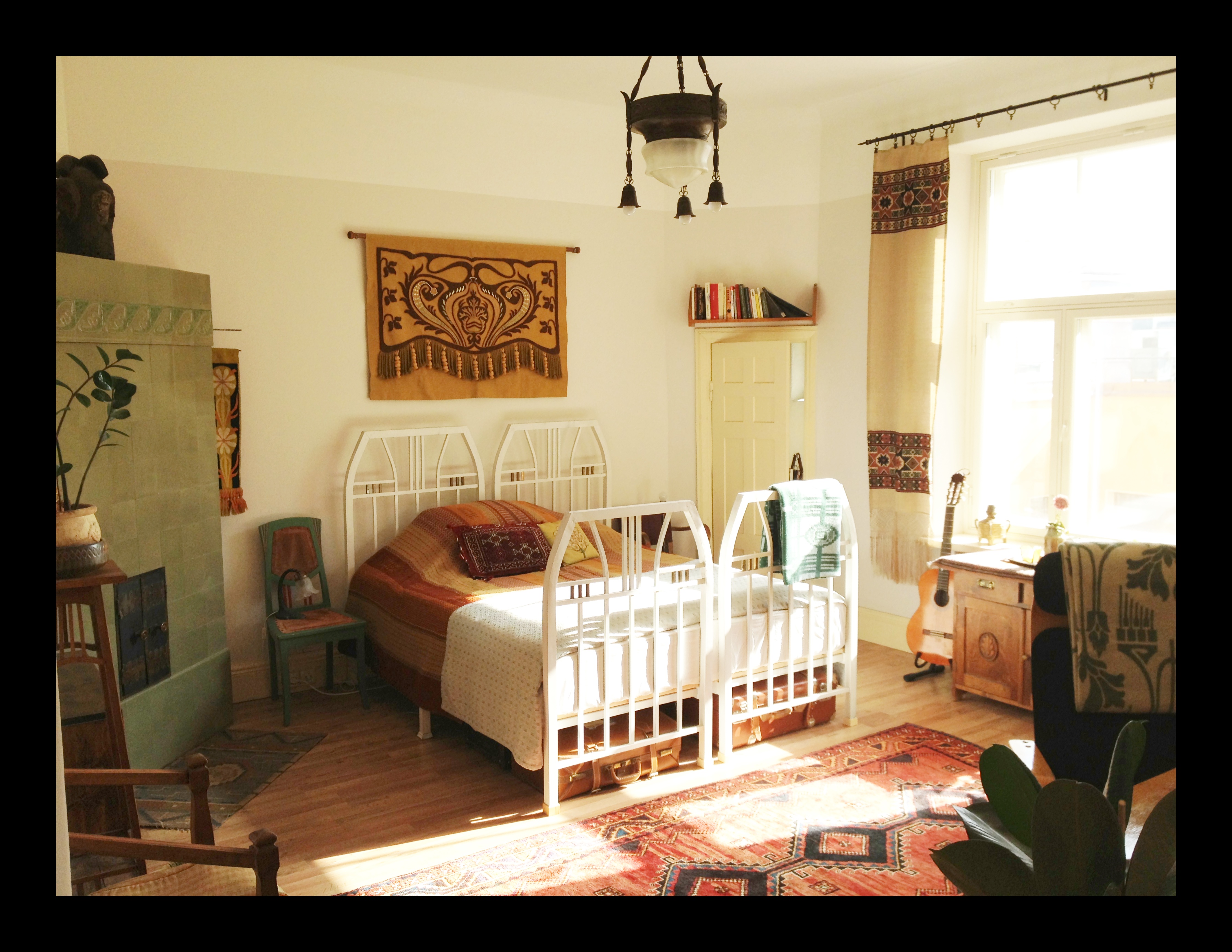
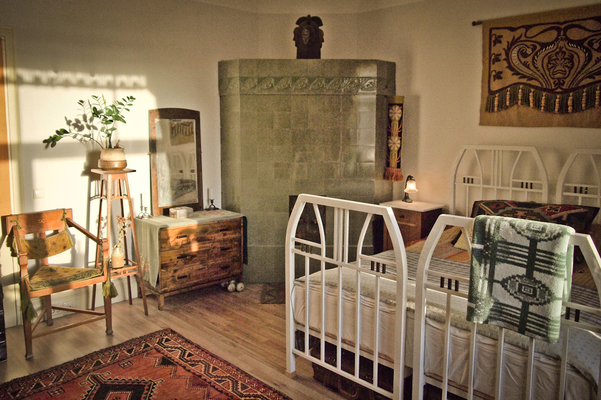
You probably noticed that I don’t have any bed side tables yet. They are proving very difficult to find (cheap). The beds will be featured in a separate story, they are Finnish, made of iron and exactly the kind of Finnish Jugendstil I’m in to.
Painting an Art Nouveau frieze around the room has crossed my mind. I am, however, doubtful I could ever muster the courage to actually ask for permission and do it.
Our project was featured in one of the Finnish dailies, Etelä-Suomen Sanomat. I haven’t managed to get my hands on the print copy yet, but there was a snippet online:
The text itself seems to be fine, but I do not agree with the header at all. Translated into English it would go somewhat as follows: The vintage commune of Käpylinna rejects ugliness and lives in the past. The first part seems to imply active action; rejecting, fighting ugliness, which I believe would be a battle lost at the start and not to mention highly fruitless. What I do reject, though, is the statement of living in the past. I am very much a contemporary person, I follow modern politics, art, culture, etc. and I don’t have a nostalgic yearning for the past. However, I do admire some of the accomplishments of our past generations and being a student of history I believe that our past has an abundance to teach us. If we wish, we can, where possible, eclectically choose from the days of yore those things we value and incorporate them into our own daily lives.
Headers are always a hit and miss deal. It is a shame, because they have a great effect on how you read a text, they suggest a certain way of looking at the subject and create (prejudiced) opinions before you even get to read the text itself. This is a trade off that is born when the header needs to be provocative in order to incite online clicks.
These things always happen, I do respect the reporter and believe she did a wonderful job. It seems in this case the header was in fact not written by her, but by someone else in the newspaper’s staff.
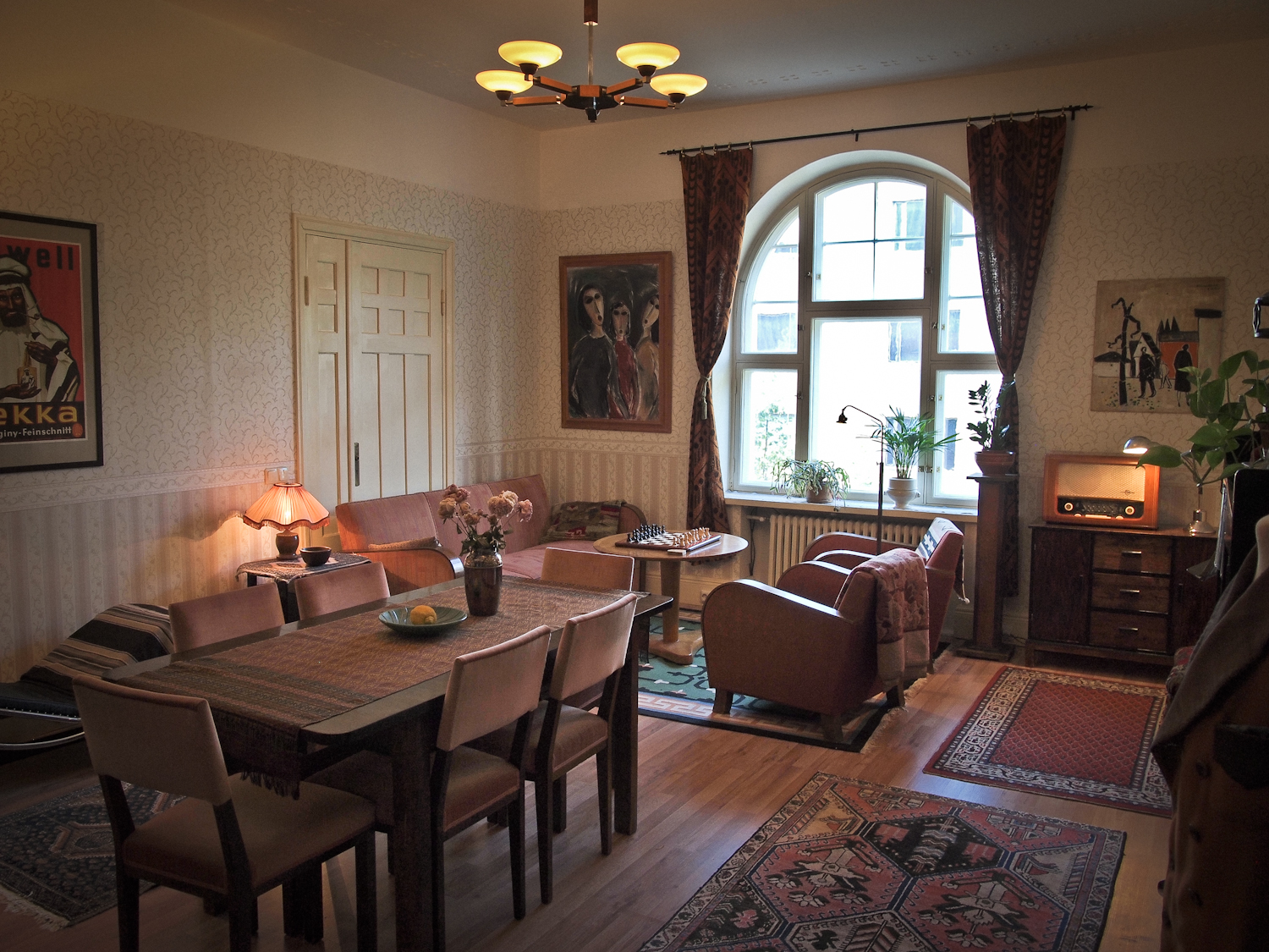
This is the living room in its current state, much is left to be done! The doors behind the sofa, for example, will be covered by a curtain at some point – I just haven’t gotten around to it yet – and more pictures will be hung on the walls.
Click to Enlarge
I took this picture now that I finally managed to find suitable glass lamp shades for the ceiling lamp. I bought the lamp off the internet for just 45 euro, it’s one of the few pure blooded 1930’s Art Deco pieces I have in the room. Very typical of the time with its dark (stained) and light birch veneer and chromed metal parts. The lamp, however, came without the shades when I purchased it. For a few months now I had been looking for suitable ones and now I did finally find them… even though I also needed to buy another lamp to get them! Having five arms in a lamp makes it substantially more difficult to find fitting shades, let me tell you! In the end the lamp ended up costing me 95€, not the cheapest deal, but significantly less than what I would’ve had to pay for it whole or in a shop, where they go for around 150-250€. In Finland, that is… I see them going for fractions of that on Swedish auctions!
In terms of other things in the room – the chairs I must mention! They were a bargain, 15€ per piece. The curtains are off the Swedish eBay, the table and chairs I already mentioned in an earlier post… Carpets are bargains off eBay (hunted by my father, he has a thing for carpets) except for the green 1930’s one, which I found in a car boot sale for 15 euro.
I only see future work when I look at this room, and will probably never be fully happy with it, but that’s what keeps driving me.
I keep a folder on my computer which contains pictures for referencing old textiles, furniture, lamp parts, clothes, et cetera. But very often I just save photos of gorgeous things… and very often those things are Arts and Crafts or Jugendstil items with geometric ornamentation. I am now going to share a few of these finds… All rights go to the owners of the pictures, if I have your photo and you want it removed, please contact me.


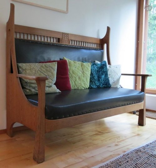


My girlfriend got me this amazing chair for my birthday! It’s a jugendstil three-legged chair, called in Finnish munkkituoli, a monk’s chair. I do not know the origin of the name, but most likely it has been borrowed from Swedish munkstol, meaning the same thing. According to the Swedish wikipedia, it is a chair type that was popular during the early 1900’s and is very uncomfortable to sit in. Both are more or less accurate, but nevertheless, the chair is a looker! The chair has a very ancient feel to it and that is most likely the reason why it was picked up by the National Romantic movement; it looks right at home in a medievalistic, neo-gothic castle!

The chair is made out of oak, it stands on three legs and the backplate has an intarsia detail in mother of pearl and veneer. It is rare to find one of these with both of the original cushions still present and intact.
Alas the original bone adhesive in the joints has decayed during its approx. 90-year-old life and thus all of the joints will need to be glued again. Otherwise the chair is in top-notch condition.
The chair will look great in my room!
While on vacation in The Basque Country I also went to visit Burgos for the great cathedral built in the Gothic style. Here I have provided some details of the interior that are Gothic (the interior is a mixture of a dozen different styles nowadays). In these examples you can clearly see how the style inspired the Arts and Crafts movement, Art Nouveau and Jugendstil. The cathedral was a good side dish for reading John Ruskin!


And just for reference, some William Morris


I went to the flea markets one day in June and this rare thing happened to cross my path.
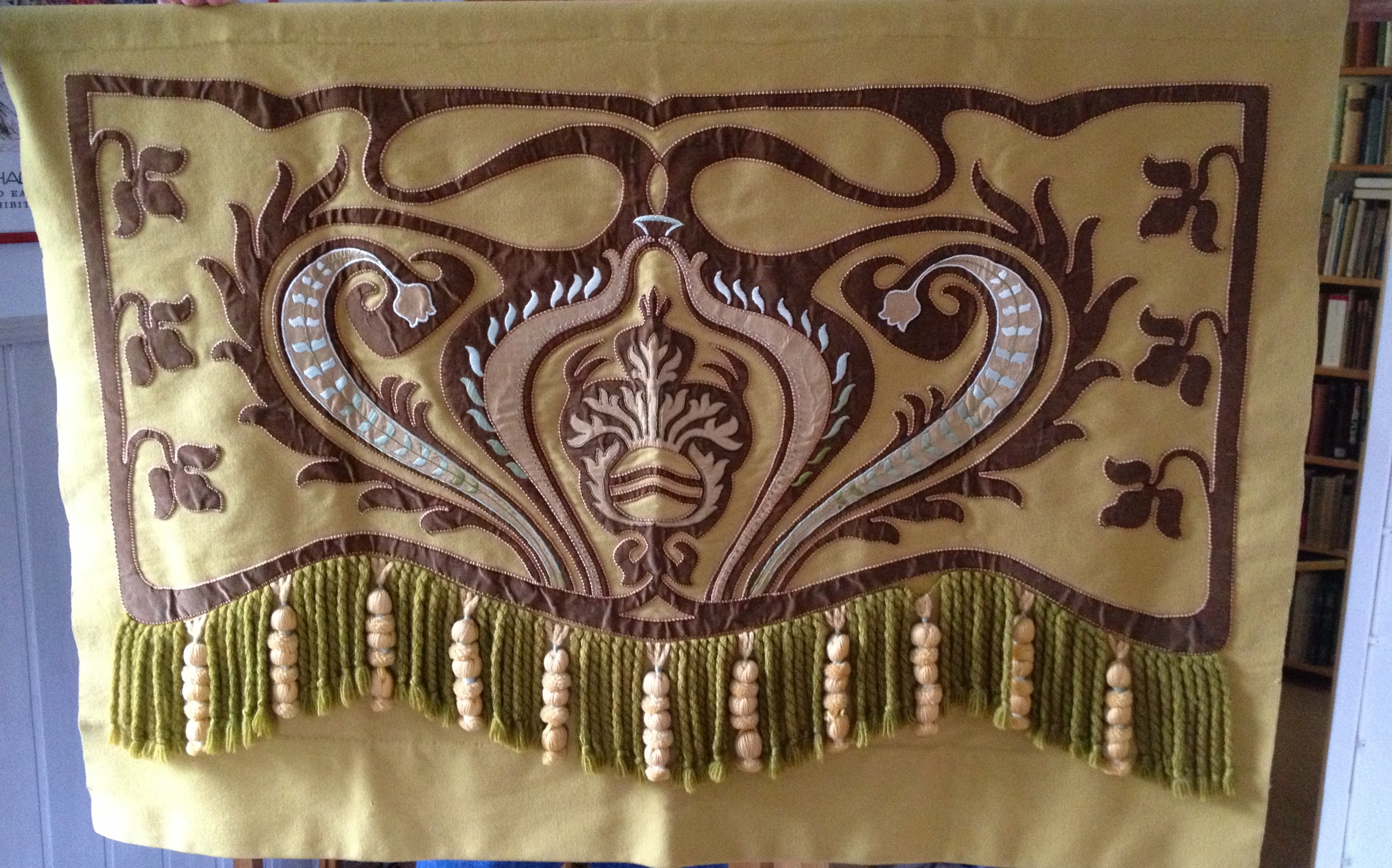
It is a tapestry from the early 1900’s in perfect condition. It only has one flea bite on the pile so miniscule it is practically impossible to see without very close inspection.
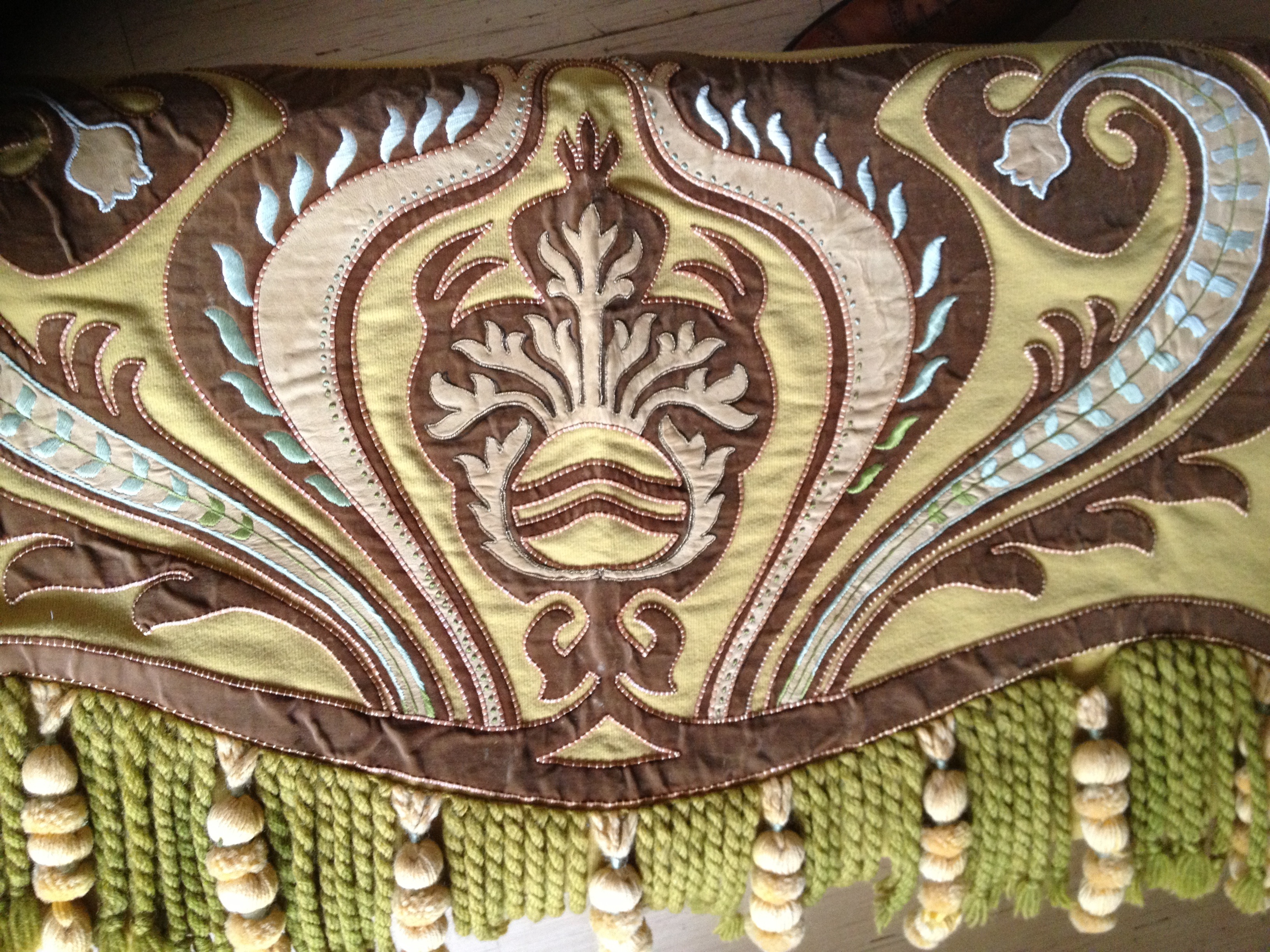
They used numerous different techniques and materials in the execution. For the base they used light, mustard yellow wool and for the design middle brown velvet. In some areas they used vegetable tanned leather. Everything is trimmed with a thin strip of the same leather.
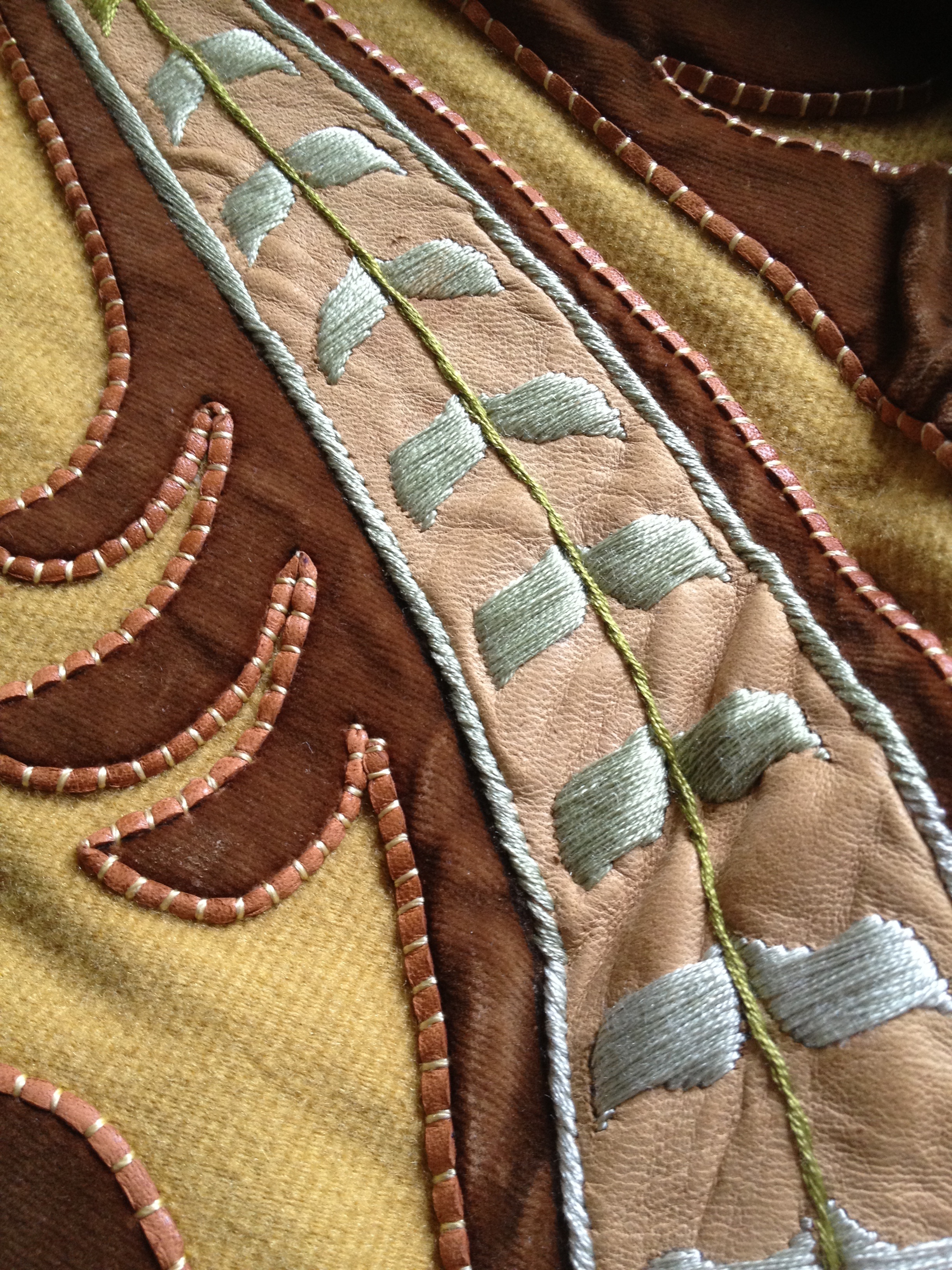
They used silk embroidery, too.

Even though here the velvet may look like corduroy, it is not.
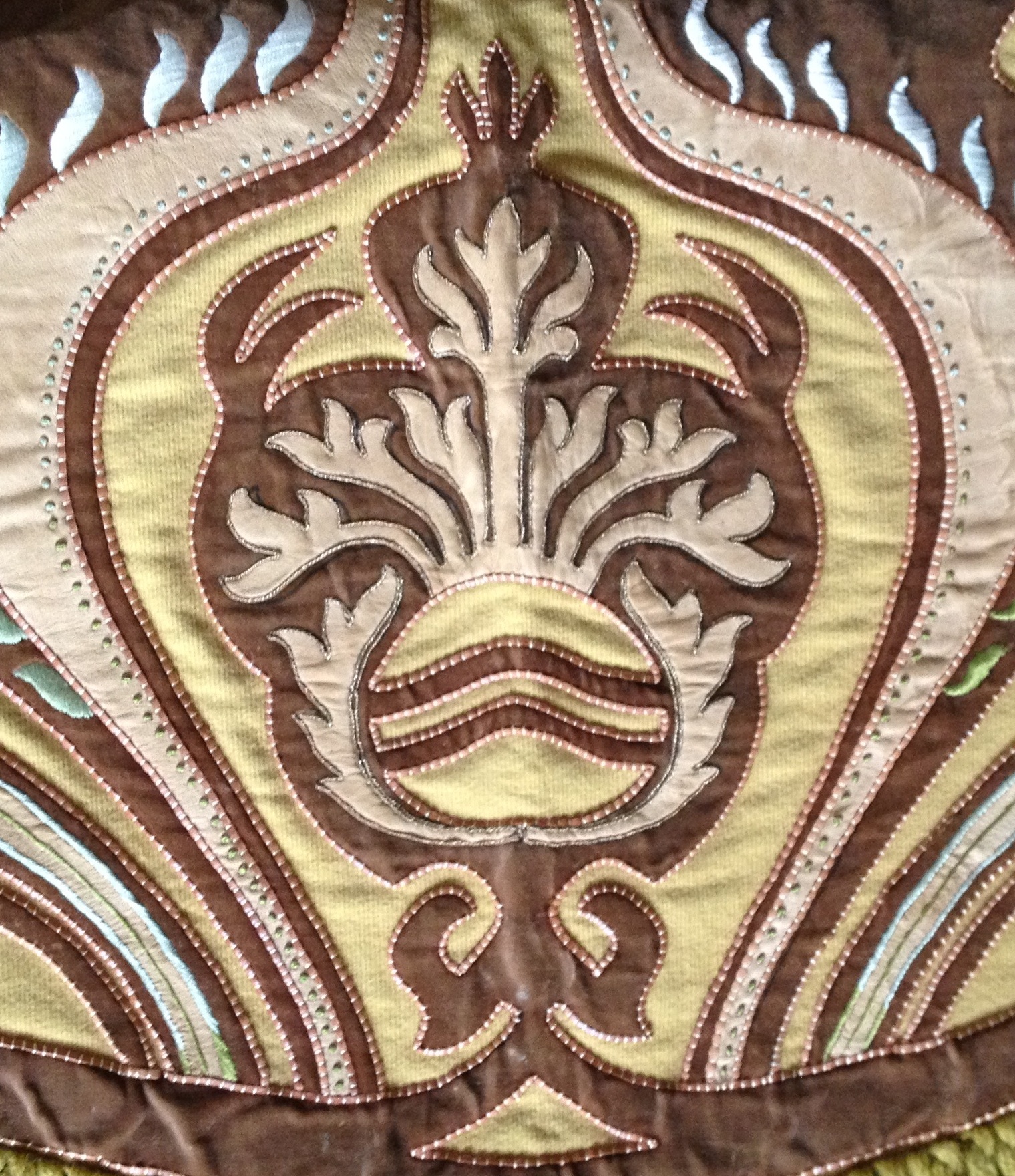
In the center they used metallic thread.
This tapestry is very rare and in extremely good condition… which made me doubt its authenticity when I first laid eyes on it. It is, however, looking at the materials, the techniques and the style, in complete accord with what they did in the early 1900’s.
Stylistically it’s not the Finnish jugendstil, but rather a different style, definitely more European. Perhaps I will have to take it to a museum for analysis.
Not a bad catch for 30 euro!
We moved in a few months ago and much has happened, so I will need to bring you up to speed.
First we went to see the apartment.

And thought it looked great, so we thought we’d take the plunge and apply for it.
After jumping through all the hoops we got it! After we got the news I got us a 1930’s table and six chairs for the living room, it was discounted so it cost something like 140 euro, a bargain really!
Then we start moving in…


Got some help from a friend to carry all the heavy things, thanks Tommi! The living room is still looking quite desolate…
Then we got some more furniture in, the sketches of what the living room should look like are tried out at this stage.

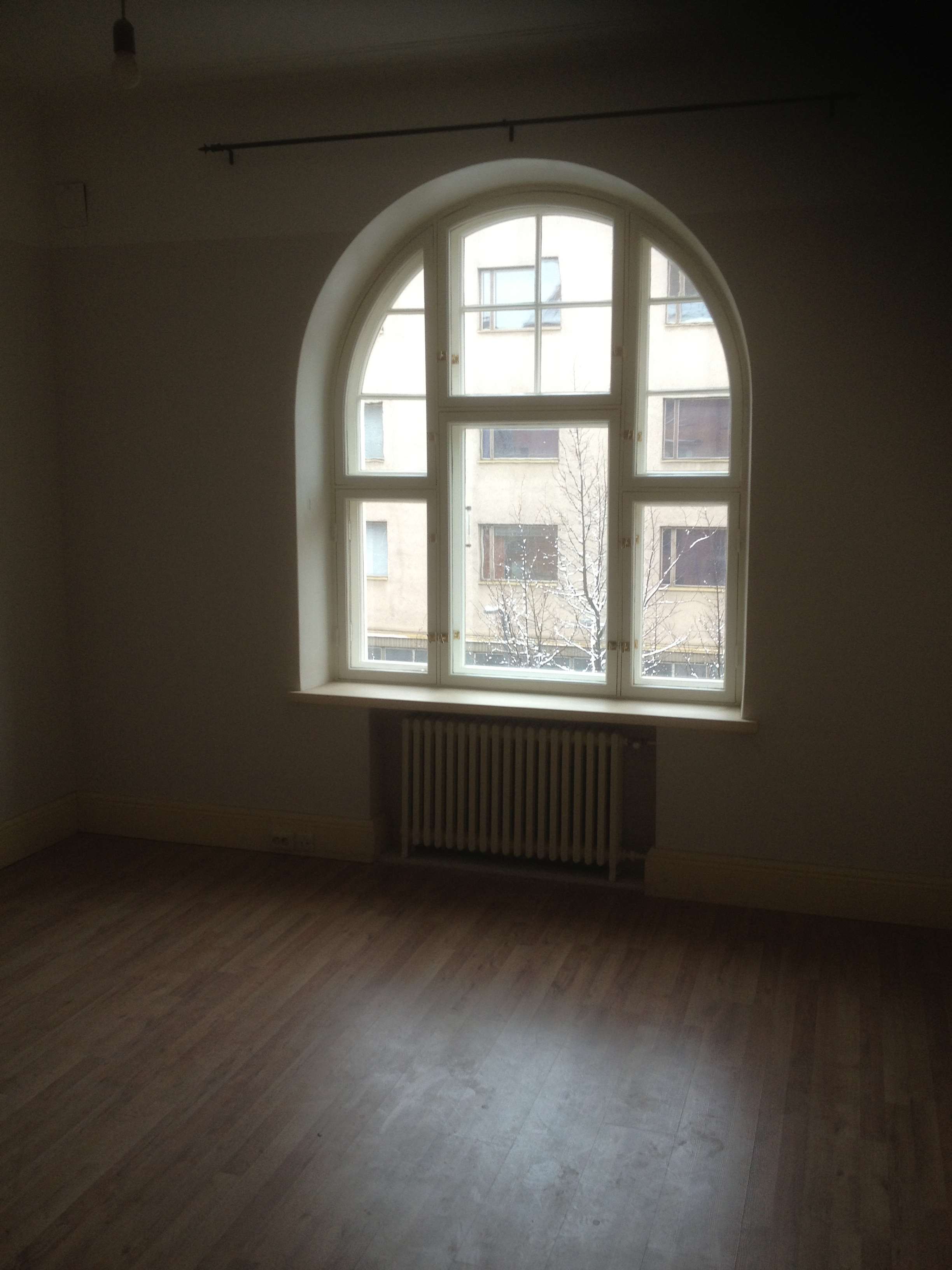
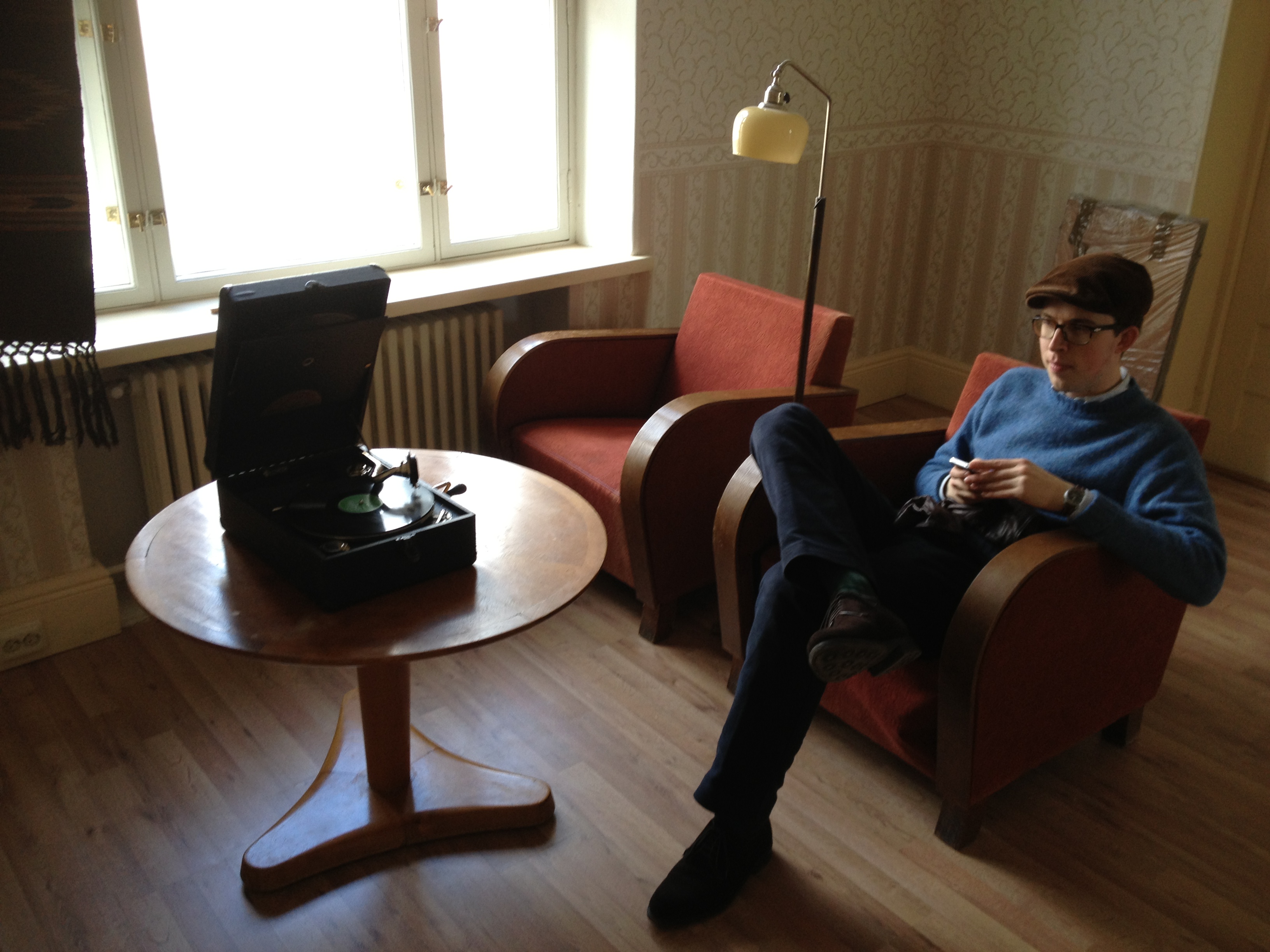
My room, it looks terrifying.

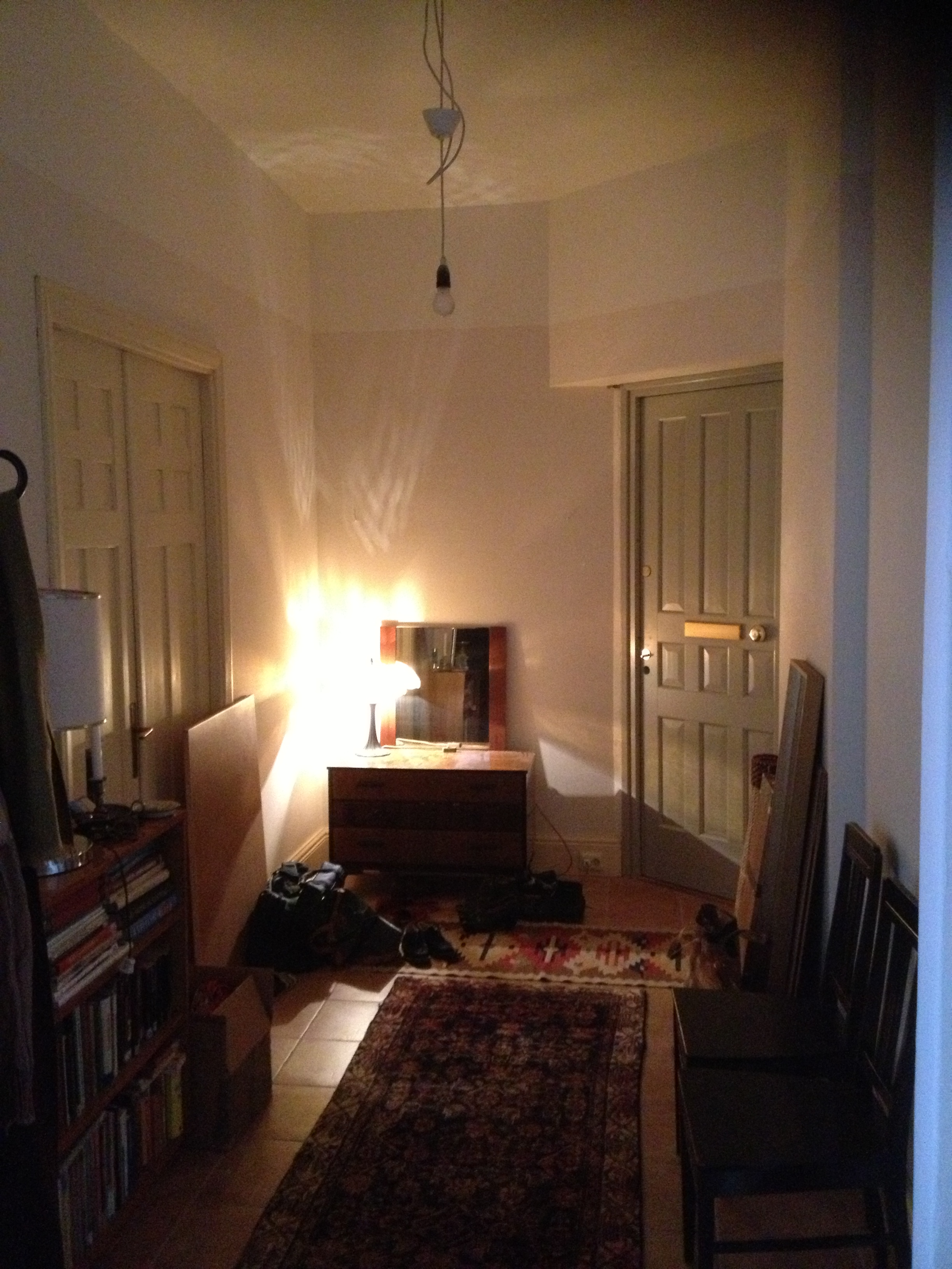
The hallway, shabby chic. Persian semi-antique (in other words: faded) carpet on the floor. Hardly visible in the picture.
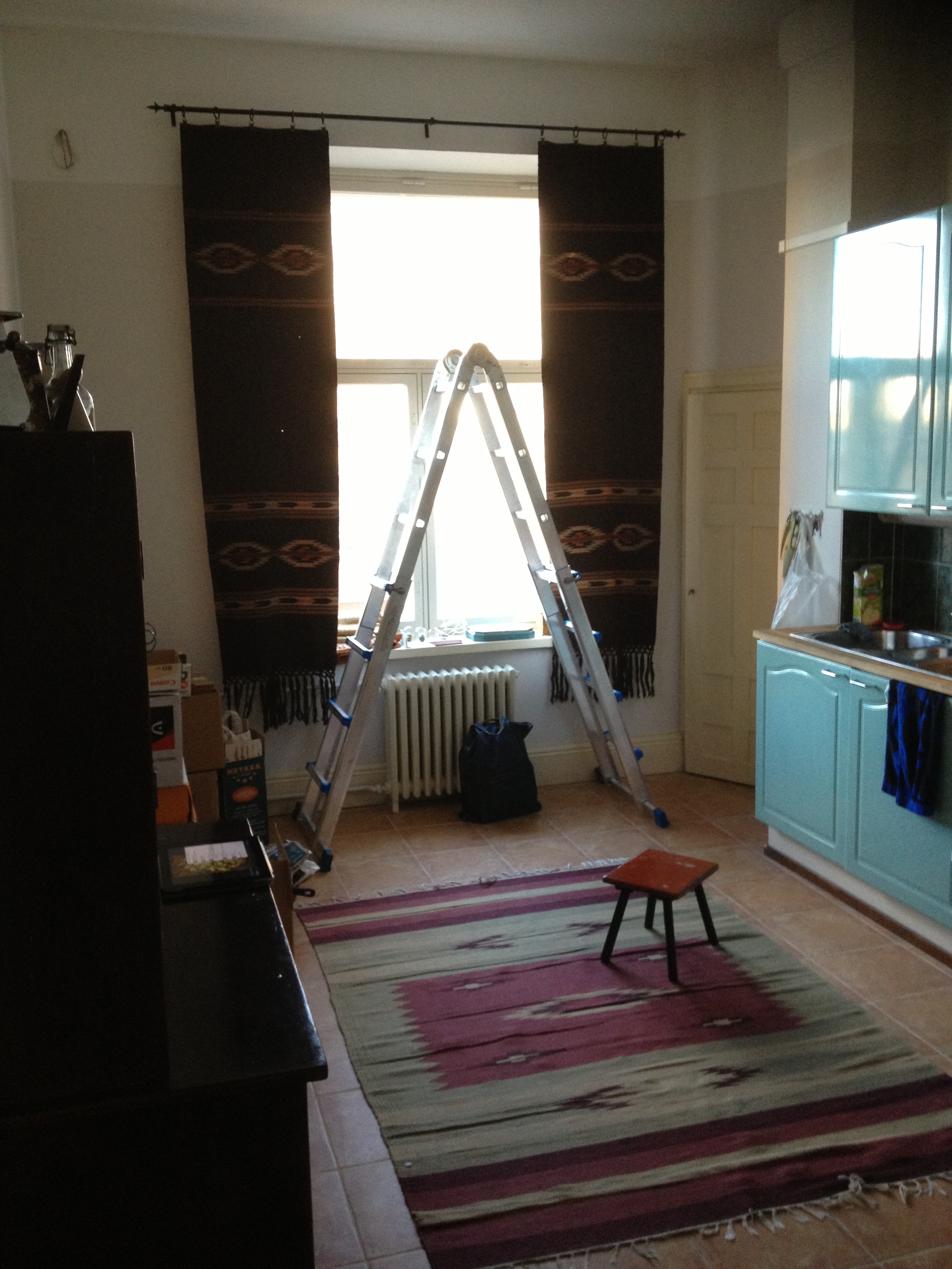
The kitchen, trying on the living room curtains in the kitchen. So far they have stayed there. The curtains were a cheap find on the Swedish eBay, Tradera.com. The ladder is very hand when attaching lamps in the three meter tall rooms.
Then when we get all the stuff in we start decorating. One of the first things I got was a gorgeous curtain on a Finnish online classifieds website, Tori.fi. Better pictures on that thing when I finally get it hanging…

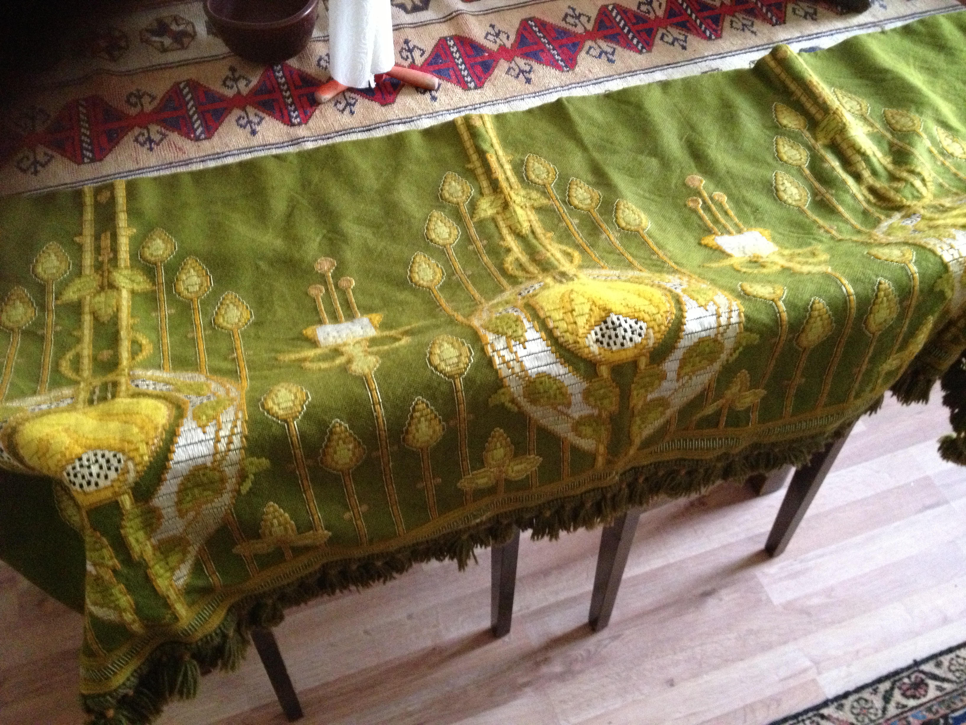
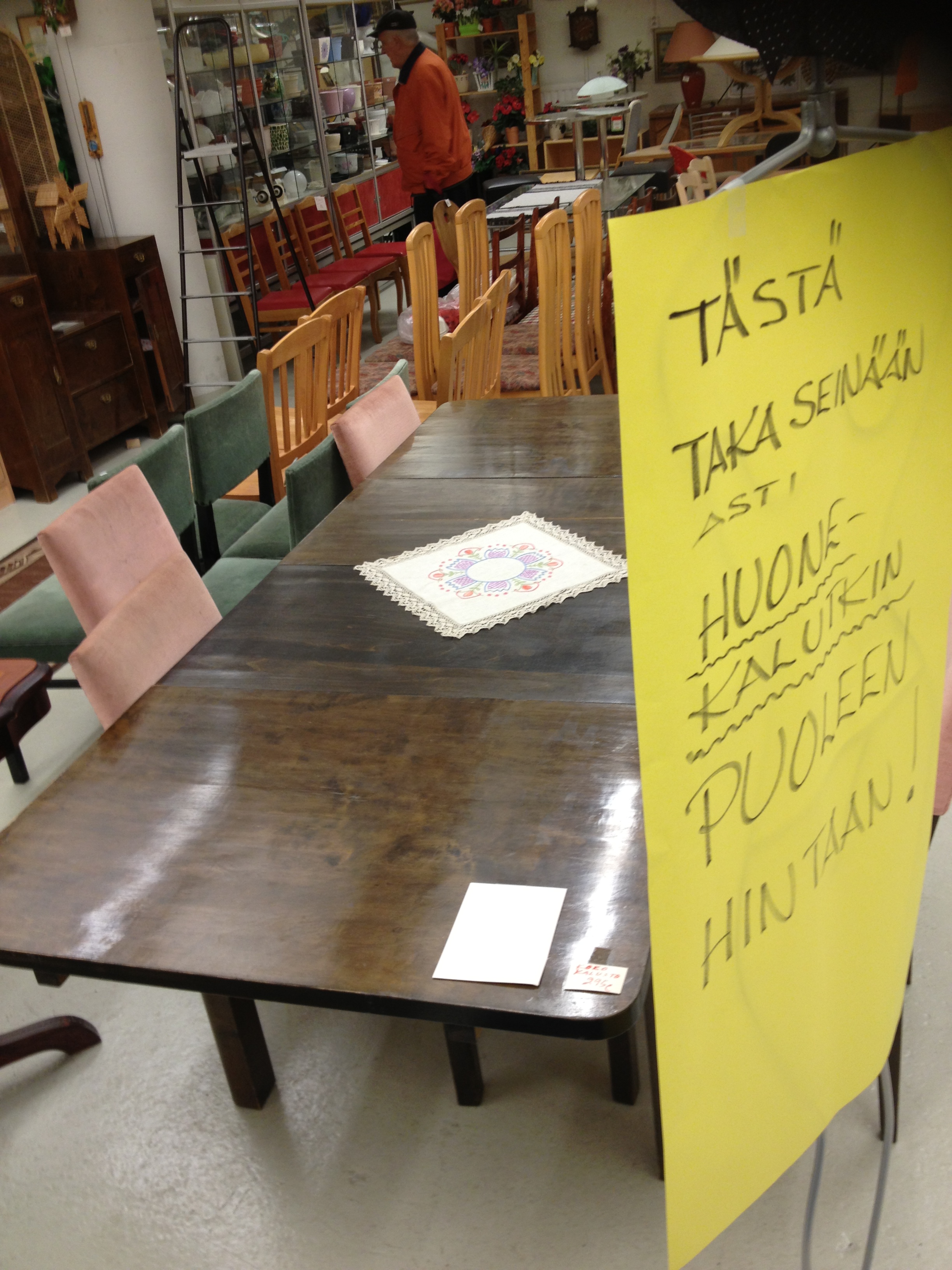
Thrifted some miscellanea…


Then I thought I’d make a sign on the door because guests came calling on the wrong doors. We weren’t sure if there would ever be any signs on the front doors since we did not even have a door handle for the first two months!
I chose to make something out of copper, just to try it out. I didn’t have any proper tools, though, so I used the other end of a potato peeler to execute the design.
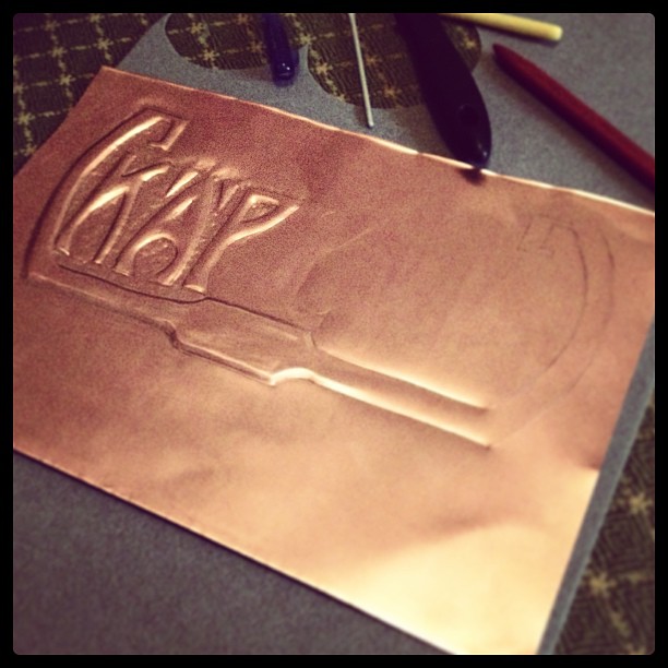

The sign says Käpylinna, a name we chose for our apartment. It’s translatable as the castle of pinecones. The story behind the name is too long to account here. And yes, I know the design is barely legible, maybe the next one – if there’ll ever be one – will be better.
More pictures to come in the next post!
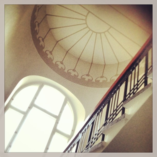
I recently moved into a new place with two friends, a stunning three bedroom castle smack in the middle of Tampere, the biggest inland city of the Nordic countries. The house was built in 1907 and it was drawn by a Finnish architect Birger Federley.
In short: the apartment is huge! Having lived for three years in a small studio, you can really feel the difference. The rooms are three meters tall, which makes even the tiny rooms feel much bigger. It also gives much needed vertical space for our walk-in wardrobe. Yes, I am not kidding, we have one. More info on that later, though.
Pictures:


Pictures courtesy of Aamulehti (Ilkka Laitinen ja Mika Kanerva)
